Is it me or...

Help Support Steer Planet:

DL

Well-known member
Joined
Jan 29, 2007
Messages
3,622
How about "An online community of cattle enthusiasts" - OH breeder I like it!

that will catch us all (we don't need to include bunnies, beefpacas, sheep etc in the logo although they are certainly welcome)

and you could do the text under SP and then www.steerplanet.com under the planet - it would sort of balance the steer (androgenous as Gyspy says!) looking off the planet into all things possible...I personally like the solid colored blue steer

 

knabe

Well-known member
Joined
Feb 7, 2007
Messages
13,643
Location
Hollister, CA
i think the image should auto change to reflect the different animals that are out there, smokies, baldies, blacks, shorties, etc.
also like the image 16 the best

.com is inferred, though some people will get confused whether it's .org etc.

i like to leave a little mystery and would remove the "an online community....", 

or just reduce it to "An Online Community", again, it's inferred there will be directories and all kinds of goodies, or "An online community for Show Steers

to me steers are the gateway to the cattle business.

to me, it's inferred that steers come from somewhere, though if recent article at msnbc is to be believed, breeders, particularly males won't be needed much anymore as they are tying to get sperm from bone marrow, so it obviously includes cows and bulls and market heifers.
 

Jill

Well-known member
Joined
Jan 20, 2007
Messages
3,551
Location
Gardner, KS
It has been my feeling that this board in NOT filled with show cattle enthusiast or clubbie folk, for the general tone of the board the cattle enthusiast actually better describes the posters on this board.

As far as the pictures, I don't really care for the big one, it seems to not be proportioned right or something, can't really tell you why, but don't like it.  If you use the smaller calf I would move it down onto the globe, it just seems to be stuck on top and out of place.  I think the .com needs to be there, that's what it is.
 

DL

Well-known member
Joined
Jan 29, 2007
Messages
3,622
Jill said:
It has been my feeling that this board in NOT filled with show cattle enthusiast or clubbie folk, for the general tone of the board the cattle enthusiast actually better describes the posters on this board.

As far as the pictures, I don't really care for the big one, it seems to not be proportioned right or something, can't really tell you why, but don't like it.  If you use the smaller calf I would move it down onto the globe, it just seems to be stuck on top and out of place.  I think the .com needs to be there, that's what it is.

Agree 100%
Liked you Jr Natl  pictures too -
still can't remember what happened to the bull picture I wanted to post for you....
 

jason

Well-known member
Joined
Mar 26, 2006
Messages
3,046
Location
Emporia, Kansas
Lots of great input.  When we get the t-shirts printed, I will be giving lots away through contests, etc. and if you would like to purchase one they will be sold at cost.

I am going to buy a rather large order to try to get the cost per shirt down as much as I can.


Will have a new update soon of the logo.

Jason
 

jason

Well-known member
Joined
Mar 26, 2006
Messages
3,046
Location
Emporia, Kansas
Also justme (funkystitches.com)  will be producing a variety of embroidered products with the logo for purchase directly from her.


DL

Well-known member
Joined
Jan 29, 2007
Messages
3,622
Cool beans!
Jason is it just me or is your bull jumping? Everytime I look at him he seems to be an action bull leaping (over the moon?)
 

shortyjock89

Well-known member
Joined
Mar 6, 2007
Messages
4,465
Location
IL
Show Heifer and Farmboy- Yes my avatar is WHR Sonny 8114 .  He's the sire of my favorite cow.  He looked as good in the pasture as he did all prettied up...it's a shame that he died so young..
 

red

Well-known member
Joined
Jan 20, 2007
Messages
7,850
Location
LaRue, Ohio
been under the weather so just got in on it! Love the new logo, much better for this group since we have some that don't even own cattle anymore. I really think it ties it together!
Like the smaller figure much better. Personally love the blue because it is just different from everyone elses logo.

I'm thinking of a get-together at NAILE. It would be fun if anyone comes up to our stall & mentions SteerPlanet & they get a shirt. Or if they already have on a shirt or hat they get one of Gypsy's world famous cinnamon rolls!

Red
 

JbarL

Well-known member
Joined
Apr 21, 2007
Messages
1,677
Location
30deg 17' 11.73 N 81deg 35'59.94&q
dragon lady said:
How about "An on line community of cattle enthusiasts" - OH breeder I like it!

that will catch us all (we don't need to include bunnies, beefpacas, sheep etc in the logo although they are certainly welcome)

and you could do the text under SP and then www.steerplanet.com under the planet - it would sort of balance the steer (androgenous as Gyspy says!) looking off the planet into all things possible...I personally like the solid colored blue steer

any font that is used will be limited ( for embroidery ) to approx 3/8 in. . for the smallest size lettering  anything smaller than that will lose its sticihing resolution and you wont be able to read it any way......a simple 4 in total design will work for a left chest  but tyring to make it fit on a hat ( embroidered) will not be resolute enough to satisfy you im sure....there you may be better off to simply put      SteerPlanet   on an embroidered hat....you could possibly add the   .com  also ( by the way....if you  type in only   steer planet....all search engines take you directly to the site.....so the .com isnt necessary to " find" the site).....it seems that heat transfer/screen print would be your best bet for t shirts ect....you'll get a bigger design for front/and or back  ( women usually prefer front designs, and men usually prefer back and/or smaller left chest placements)  the stitch count will be limited to what you can embroider on a t shirt with out getting a " pucker" around a design that is to large for less dense material after washing.  some of my upperend customers add small discrete verbage to sleeves of short sleeve shirts and  back neck line placements as well....with the screen print/ heat transfer option you will be able to make larger more colorful hence more noticeable
designs....depending on the what each one's personality deems.....BIG AND LOUD....  verses  ...small/discreet...... several designs according to size/material/ embroidery/ heat transfer will be available to you...once you narrow down what process/es
you are going to use on what garments/hats...you Will probally end up with 3 or 4 different options  i believe   example:
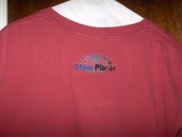
i  simply added ( embroidery )  only the word "SteerPlanet " to the sleeve of my favorite  JbarL  logo shirt and now fly 2 colors at the same time...i am going to add the world logo with" SteerPlanet" only to the back neck of one of my t shirts and see how that looks...
thanks JbarL
 

DL

Well-known member
Joined
Jan 29, 2007
Messages
3,622
I think what jbarl says is pretty much right on re size etc - I think we need a picture of the back of your t-shirt

in regards to the logo on the board I think the .com drops it off to the right - it seems unbalanced - since I believe we are a balanced group how about ditching the .com and underneath "An online community...." in smaller letters by the pole "steerplanet.com"

that gives the name - the community affiliation and the web address plus the blue steer

or we could simply say steerplanet home of the blue steer

NEW CONTEST - NAME THE STEER
;D
 

DL

Well-known member
Joined
Jan 29, 2007
Messages
3,622
keep 'em coming ....good, but nothin' flips my minnow yet...the winner will be picked by a biased mad woman and receivie little other than good wishes and eternal planetary fame
 

JbarL

Well-known member
Joined
Apr 21, 2007
Messages
1,677
Location
30deg 17' 11.73 N 81deg 35'59.94&q
dragon lady said:
I think what jbarl says is pretty much right on re size etc - I think we need a picture of the back of your t-shirt

in regards to the logo on the board I think the .com drops it off to the right - it seems unbalanced - since I believe we are a balanced group how about ditching the .com and underneath "An online community...." in smaller letters by the pole "steerplanet.com"

that gives the name - the community affiliation and the web address plus the blue steer

or we could simply say steerplanet home of the blue steer

NEW CONTEST - NAME THE STEER
;D
not a great color shirt to work with.....but thats the one that got the call ;)  thanks jbarl
 

Attachments

  • sp.jpg
    sp.jpg
    23.6 KB · Views: 221

JbarL

Well-known member
Joined
Apr 21, 2007
Messages
1,677
Location
30deg 17' 11.73 N 81deg 35'59.94&q
thanks to all for the PM contacts with all your intersts/ requests  and ideas .....please continue to use my PM for any furtherquestions/comments or ideas your have been having....thanks especially to Sandra and Ben...and good luck this weekend in Oklahoma....look forward to seeing on the site when you return......thanks to all  jbarl
 
Top